I’ve been fascinated by BBC’s (and to a lesser extent, The NY Times) coverage of those crazy ass Somali Pirates. Every few weeks or so, they do a story that just makes me shake my head in wonderment and disbelief. Seriously? Is this really happening? How much are they getting paid? Pirates are driving around town in BMW’s and flying bands in to play at their three day wedding feasts? Sometimes, I just want to sell all my stuff on craigslist and use the money to fly to The Gulf of Aden where I can make some REAL money in the pirating business.
Cuban Link
Speaking of pirates, New York Magazine, always a step ahead of the proverbial game, is further solidifying my theory that the only hip-hop group “the media” cares about is Wu-Tang by featuring a brief review (with audio) of Raekwon’s (really?) new single off his new album Only Built For Cuban Linx II. Oh, right. Ghostface is in it. That explains everything. Okay, that had nothing to do with pirates at all, but you should check out the track. It’s kinda alright, and by kinda alright I mean pretty good.
My friends and I have given 2009 a few nicknames already: Year of The Hustle, The Age of Responsibility, Year of The Penny-Farthing, and The Year of Unemployment. None, however, ring more true than one I came up with just this morning, 2009: Year of Not Ordering Take-Out Every Night Anymore. With “the economy” and recession being clubbed into our psyche on a daily basis, I’ll spare ye the budget talks but I will say, since I no longer order take-out every night, I seldom visit what used to be one of my most frequented sites — MenuPages.com aka The Pusherman.
Further proof that 2009 is/will be The Year of The Penny-Farthing
My roommate and I do sometimes get lazy, and fall back on our old habits. This past weekend we decided to order from one of the many Mexican spots in this section of Brooklyn. You’d be surprised how many there are. Because we had lost, or I had torn up in celebration of the new year, all our menus, I had to make a visit to The Pusherman. Imagine my surprise when I saw The Pusherman had gotten a makeover. Not only did he get himself a new logo, but a whole new interface. Pusherman, good to see you’re finally getting with the times. I must say, though, you’re looking a little wider than I’m comfortable with. Ya look good though. Truly.
The new logo was designed by Mucca Design. Brand New has also covered it here.
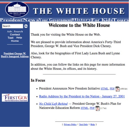
I have to admit, before this past election, I didn’t even know The White House had a website. Okay, maybe I did, but I definitely never went to it. With the inauguration of President B. H. Obama, whose entire campaign platform was the promise of change, there’s no doubt expectations are high. The people want to see change, and they want to see it relatively soon. Well, word on the street was that at noon, inauguration day, the most important change (for the purpose of this blog anyway) happened, when THE American website was updated to reflect the Obama Administration.
Well, it’s no surprise the site looks good. What I did find surprising, however, was that, as you can see from the before and after shot, the Bush Administration’s White House site didn’t look all that bad. The new site does feel just a little sexier though. Maybe it’s the close up of Obama, giving us that Obamatude. Seriously though, the site is quite nice. I particularly enjoy the blog (not sure if that’s a new feature), and the fun facts page which features a photo of the former first kitten! I also dig that the “home” button in the navigation is the American flag. Nothing like a little visual pun when you’re feeling patriotic.
Oh, check out this shot of The White House site circa 2001. *shudders*
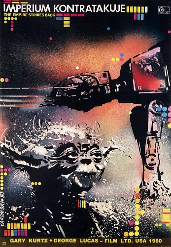
Every few years, someone (re)discovers Polish film posters and links to sites featuring the posters become viral again. This one has been going around in the last few days. The posters, of course, are undeniably wonderful.
With the abundance of blogs out there, how do you set yourself apart from all the rest? One way to do it is to have interviews. That would only make you different from about 70% of the folks out there. If you REALLY wanted to set yourself apart, you’d get yourself a video camera, a fisherman’s cap, a canoe, and a cigar, and if you’re particularly industrious, a Midwestern sunset. Then you go out and you find some of the real heavyhitters in your chosen field and you channel your inner James Lipton and record some truly compelling interview footage. Oh, right — Design Smoke has already done that and done it quite well. Featuring interviews with folks like Steven Heller (I think I might be bordering on fanboy), and Jen Forss of Non-Format, Design Smoke isn’t so much a blog, as it is a full scale production. I have to admit that when I caught wind of it, I was skeptical, but after watching the interview with Jon Forss, I was hooked. Dude had a canoe. That’s about as ‘pimp’ as you can get. I have said enough. Here’s the link already: www.designsmoke.com.
In other news, I was generously given a ticket to see Notorious this past weekend. While I’m going to refrain from writing a review, I will say it’s definitely worth seeing. If you can you should fly out to Brooklyn and watch it at The Court Street Cinema. Only there can you see the movie and have the entire crowd sing along to pretty much the entire soundtrack. It’s a messed up thought but I think hip-hop might have its first Rocky Horror Picture Show. Maybe not. Sadly, my question regarding the identity of the Ready To Die baby was not answered. Although, my friend tried to convince me that she was, in fact, the Ready To Die baby. I don’t think so, lady. Good movie though. B+
What else, what else? I only recently became aware that I could have clients pay me via paypal. I hadn’t even told anyone that I was accepting paypal, when lo and behold I got an email saying I had a payment on paypal. Funny how the world has a steady current. That being said, if you haven’t already begun accepting paypal, you should definitely get on that. This is worth checking out too: How 20 designers charge their clients.
Happy MLK day! As always, to be sure it was an actual holiday, I checked the google homepage for affirmation.
One look around here and you’ll see I’m a huge fan of unnecessary quotes. Most of the time, I used them for comedic effect, but more often than not, it probably just ends up confusing you. Anyway, The “Blog” of “Unnecessary” Quotation Marks is a blog devotedly entirely to the misuse of quotation marks. Hilarious.
Ed Fella, detail from his Cranbrook Thesis Project, 1987
There isn’t many an art school whose name, when mentioned, brings to mind a specific style of graphic design. Most student work reflects the prevailing trends of the day. Cranbrook, however, is one of those rare schools with a name that is synonymous with a design ‘style.’ The graphic design work of many Cranbrook alums often treads the line between art and pure experimentation. The reason for this is due to Cranbrook’s approach to teaching, which, according to Meggs, “has long emphasized experimentation while rejecting a uniform philosophy or methodology.” I think it could also be attributed to the work of graphic design legend, Cranbrook alum, and CalArts professor, Ed Fella. His work has had a tremendous impact on not only his students, but on an entire “generation” of designers. His typographic experimentation, which could possibly be traced back to Dadaism, was a precursor to the deconstructed type now synonymous with the early to mid 90s (David Carson).
While I’ve never been big on the whole 90s aesthetic, Ed Fella’s whimsical work has inspired me since I first came across it, back in college. There’s a kind of intimacy in his work that you don’t (and probably shouldn’t) find too often in graphic design.
Phil Lubliner, Bingo, 2004
There are a couple designers working today who I’d say come out of the same tradition of typographic experimentation, and whose work I find equally enjoyable. Fellow Brooklynite and Pratt grad, Phil Lubliner’s work has a quality all its own. Alex Trochut’s work has the same whimsical quality but in digital. Lastly, and the inspiration behind this entire post, is the work of Cranbrook alum, Matthew Gavin Walsh. His site is essentially a blog, but a blog like no other, because it is made up entirely of his doodles, illustrations, and random musings. The Ed Fella influence is apparent, but Walsh’s brain is operating on it’s own wavelength. Just a quick scroll down the page and you’ll get an idea of what I’m talking about. It’s a thoroughly enjoyable experience.
Behold! The three greatest hip-hop albums of all time.
Just kidding. Actually, most hip-hop scholars would say the first two albums, Nas’s Illmatic and the late Biggie Small’s (The Notorious BIG) Ready To Die, are among the greatest hip-hop albums ever made. The third album, Lil Wayne’s Tha Carter III, however, might have more fans in the 16-and-under set. Who knows? Maybe it will one day be considered one of hip-hop’s greatest albums. I haven’t listened to much of it, so I couldn’t tell you. Besides, this blog is about design (and stuff) so I’d like to uncover a not so widely known secret about these three album covers. If it is widely known, I didn’t know, so pretend you didn’t know either.
Lets begin with the first album, Illmatic. Released in April of 1994, it was Nas’s debut, and some say his best album. The album cover is a shot of young Nasir Jones, superimposed on a backdrop of what I assume is Queensbridge, the rapper’s stomping grounds and the subject of many of his songs. It’s nothing groundbreaking, but then again, what hip-hop album covers are? It works though. Gets the point across fairly well.
Ready To Die was released in September of 1994. It was Biggie Small’s debut album, and is widely considered the greatest hip-hop album of all time. This album is near and dear to my heart as it is one of the first hip-hop albums I can associate with a specific time and place in my life. Not only that, but it is hands down the best monday morning album ever. Back when I used to take the subway to work, I used to bump this HARD in the AM, looking at other commuters like I was all tough. Anyway, I’m getting sidetracked. The album cover is probably my favorite hip-hop album cover. It’s a shot of a baby, whom I always thought was meant to portray not only a small BIG but also reference the Bad Boy Entertainment logo. As a kid, I thought it was brilliant. Actually, I probably just thought it was “dope.” The image has always stuck with me though, which says a lot about its effectiveness.
Bad Boy Entertainment Logo
This is where things get fun. There’s a bit of controversy surrounding the first two album covers. Apparently, it has been suggested that the concept for Ready To Die’s cover art was taken from Nas’s Illmatic. Interesting. I don’t see it. Sure, both have portrayals of the artists as children, but beyond that, there’s nothing there. Okay, maybe the colors, but beyond that, I’d say they’re pretty different.
Nasir, himself, addresses the drama in his song “Last Real Nigga Alive” (thanks Grover)
Fast-forward to June 2008. Lil Wayne releases Tha Carter III, his sixth album, and the third player in this little study. Clearly the cover art is referencing Illmatic as well as Ready To Die. Actually, the album art could even be called the offspring of the first two albums. Not only do you have Lil Wayne as a baby, which is undoubtedly inspired by Ready To Die, but it’s a close up and it has a similar layout to that of Illmatic. Lil Wayne takes it a step further though, by giving Little Lil Wayne his signature tattoos. Unlike the alleged “jacking” of the Illmatic concept by Ready To Die, this is obviously paying homage. And while the photoshopping looks a little suspect, I quite enjoy looking at that Little Lil Wayne. I’d be proud to call him my son, though I’d give him a timeout for writing all over himself with a tattoo needle. Daddy’s things are not toys, thank you.
So there you have it, one of hip-hop’s great conundrums covered right here. I heard there’s a Notorious movie coming out soon. Maybe it’ll shed some more light on the album art question. For one thing, no amount of google-fu could unearth the identity of the Ready To Die baby. Lets just hope he isn’t out there chasing dollars by trying to become a designer like some other album cover babies from the early 90s.
“. . .however dark the economic picture, it will most likely cause designers to shift their attention from consumer products to the more pressing needs of infrastructure, housing, city planning, transit and energy. Designers are good at coming up with new ways of looking at complex problems, and if President-elect Barack Obama delivers anything like a W.P.A, we could be “standing on the brink of one of the most productive periods of design ever,” said Reed Kroloff, director of Cranbrook Academy of Art.”


 Posted by tishon
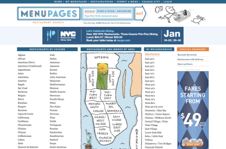


You must be logged in to post a comment.